ux design, user research
Beyond Tourism
Make a meaningful impact on the communities you visit.
Timeline
January 2017 - April 2017
Teammates
Devin Bell (HCDE), Becky Baron (HCDE), Darren Hou (AMATH), William Du (COM)
Role
UX Designer & Researcher
Tools
Whiteboarding + Sticky notes, Figma, Invision, LucidChart
Project Overview
This project was done as part of the Pixel Project under the team name "spitball.". Beyond Tourism was proposed by Artefact (a design firm based in Seattle) to produce a clickable prototype for an existing travel company based on project requirements. Our task was to design a tool to help travelers find volunteer opportunities in a new city. The guidelines followed as such:
- The tool should allow travelers to search for and filter volunteer experiences at their destination. It might also allow travelers to first discover a volunteer experience they’re interested in, and based on that experience choose their destination (destination is secondary to the experience)
- The tool should be a new feature in the application or website for an existing travel company of your choosing. (eg. Kayak, REI Adventures, Expedia, Lonely Planet, Trip Advisor, etc). Be sure to consider how the new tool fits into the existing structure of that company’s online presence.
The final solution integrated volunteer opportunities on the TripAdvisor desktop platform, and was named a close runner up for the Pixel Project design competition by Artefact.
User Research
After receiving the project, we attended a workshop lead by Sarah Zuberec on determining problems and solutions. This workshop gave great insight on how to tackle the project requirements and the question at hand. The main questions we sought to answer were:
- Which device is best to target for this product
- What factors influence their travel decisions?
- What are existing travel sites doing well?
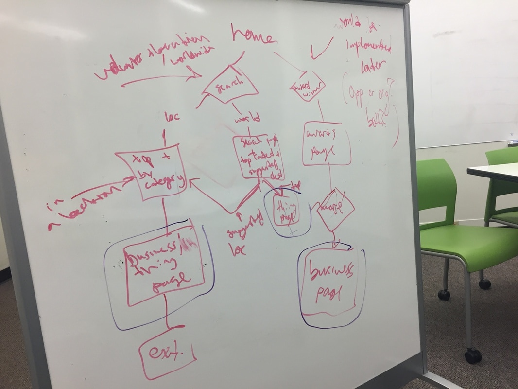
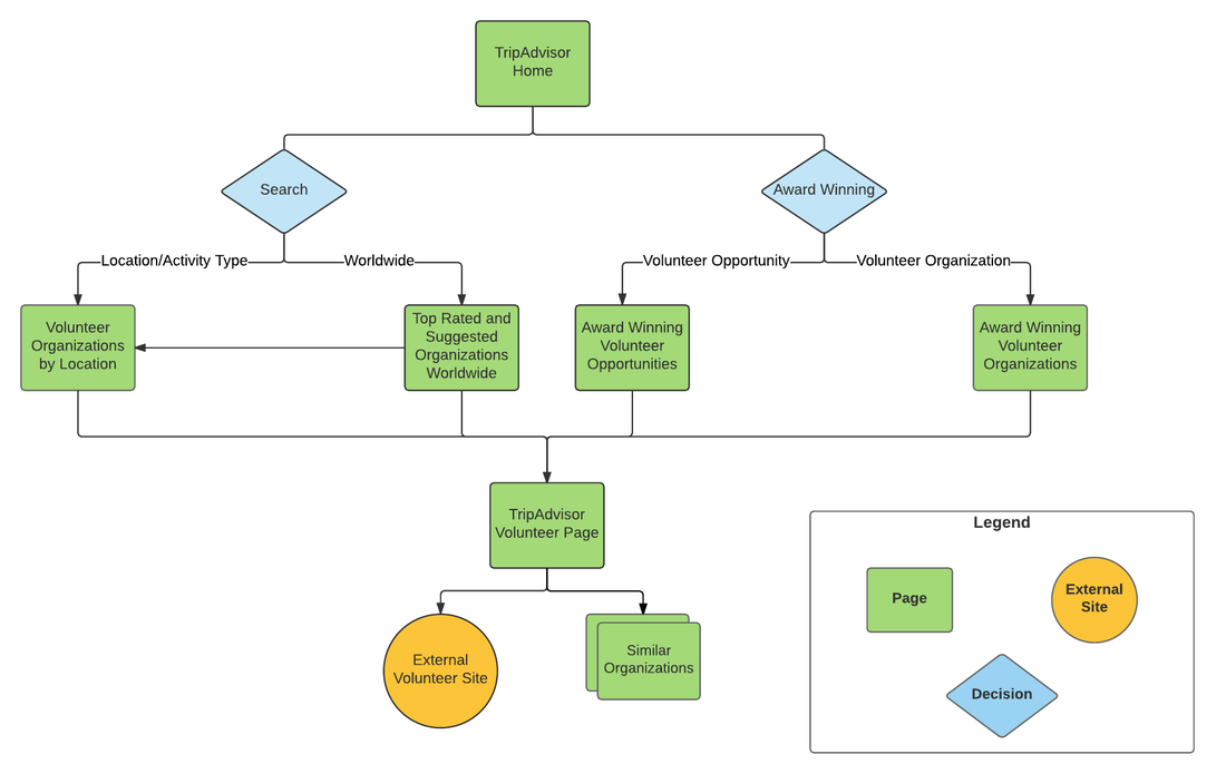
This phase led us to our guiding vision statement and key path scenario, including how volunteering opportunities could be integrated into TripAdvisor's existing information architecture. We wanted the experience to feel natural, and as though it had always been there for new and returning customers. Additionally, one of the key elements we alsowanted to highlight was that the experience was meaningful and not just a 'voluncation' where the experience doesn't actually aid the community long term.
The service we chose to integrate into was TripAdvisor because it catered towards activities. REI Adventures did as well, but the adventures were expensive, arranged through REI and destination seemed primary. With TripAdvisor, we saw room for integration because it dealt with 3rd party organizers and had a number of already established categories. We chose to design for a desktop platform because that was the preferred method of planning trips based on our survey results.
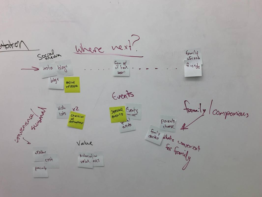
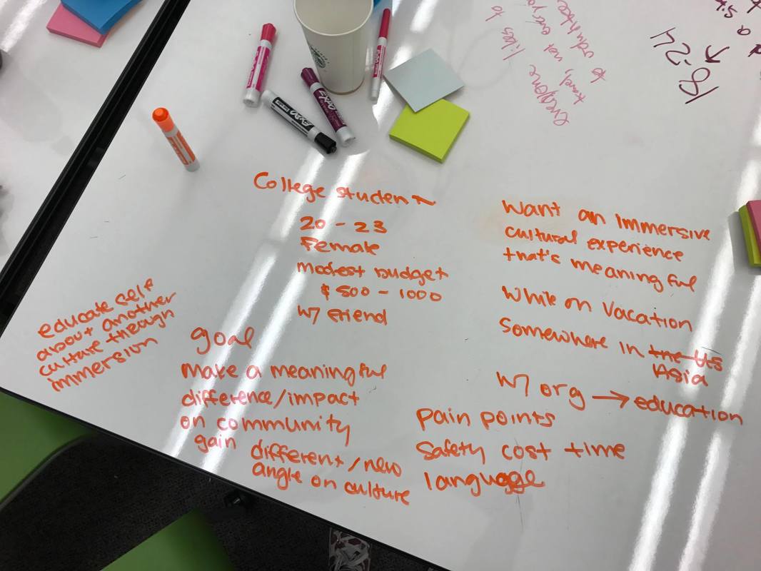
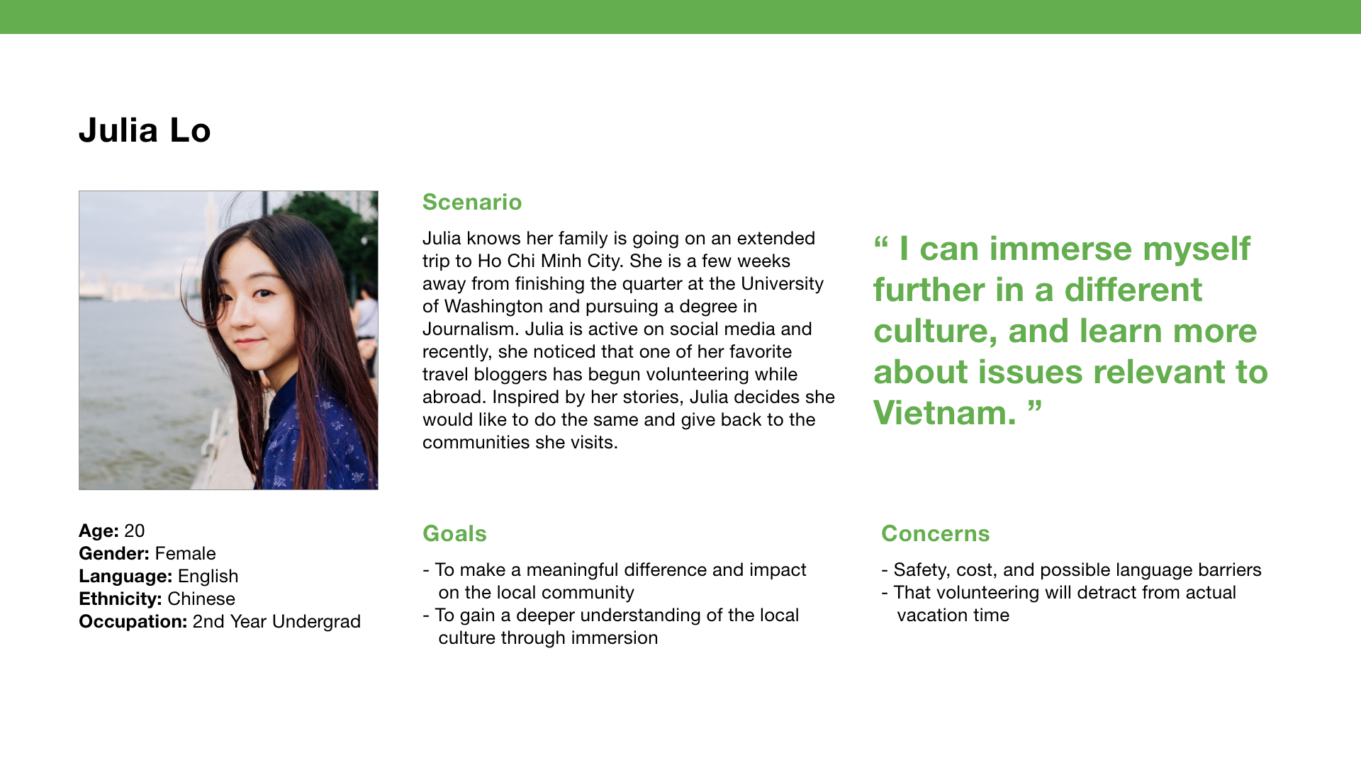
TripAdvisor believes in the power of travel, and enabling their customers to unleash the potential in their journeys through a variety of planning tools. As travelers, we have the power to make a difference to the communities we explore. Beyond Tourism will expand the TripAdvisor platform to connect people to volunteer activities worldwide.
Ideation
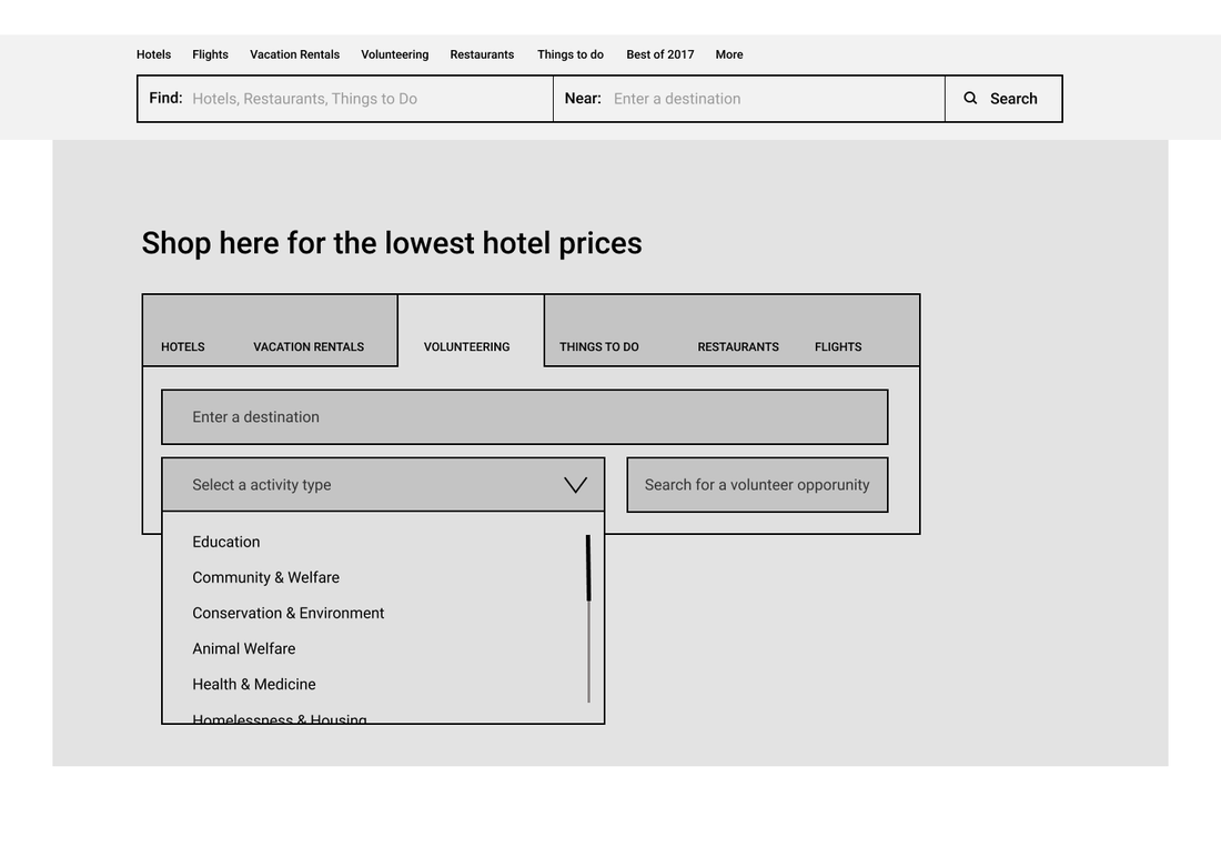
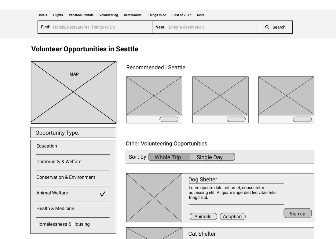
We did not receive too much feedback from the first presentation, so we began ideating a sketching out initial concept of how to integrate into TripAdvisor. During our initial sketches, we made sure that they took the existing information architecture into account. It was interesting working with constraints, and I enjoyed the experience a lot.
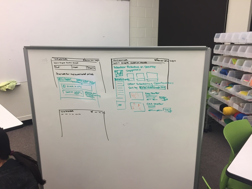
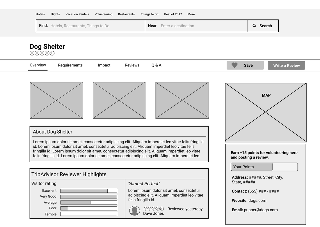
- Give users the option to sort their searches by more than One Day/Whole Trip
- Add in a "call to action" - such as Sign Up Now
- Why should users get involved?
- What happens if fields are not populated?
- It would be nice to see a ranking of the organization from an external source
- More specifics about activities
- The point system progress bar was confusing
Iteration
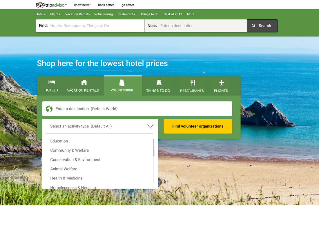
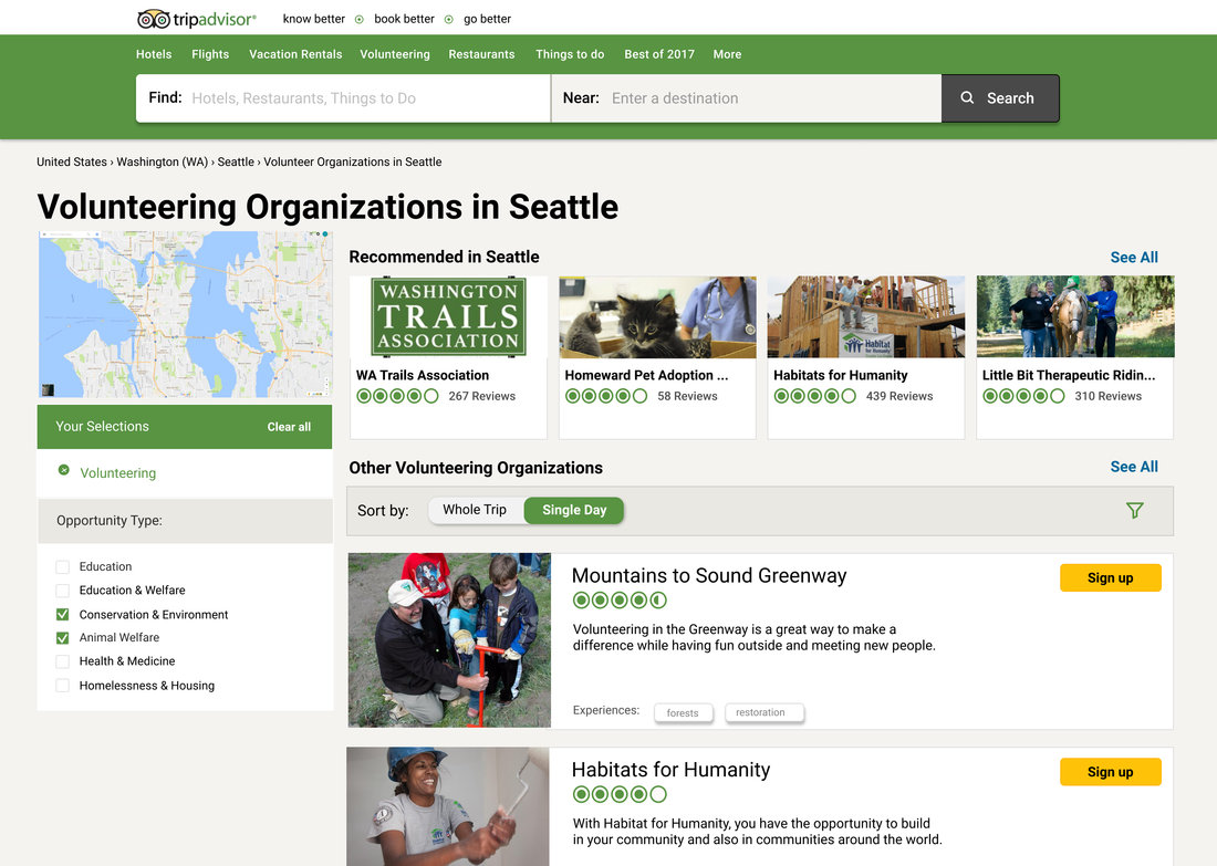
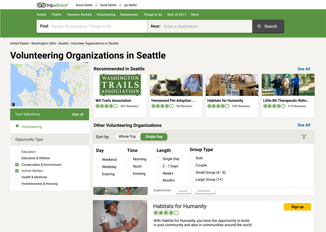
Becky and I made revisions and designed the High Fidelity versions of our prototype on Figma based on the feedback. Most of our focus went into replicating the TripAdvisor experience, so that the volunteer aspect felt natural to the existing system. For the final designs, I worked on most of the Home page and the Volunteer Organization Results page, with minor contributions to the single organization page.
Below are the final mockups, excluding the volunteer organization page (due to size). A demo can be seen above or viewed on InVision!
Reflection
Overall, the Pixel Project and Beyond Tourism were an insightful experience. Courses within HCDE usually focus on creativity and have a lot more flexibility (due to a lack of constraints). Integrating into an existing system was an exciting challenge and also some guidance on how to design the interaction. Although we were limited by time, I would like the opportunity to explore through "Award Winning" opportunities. This was one section we were not able to design for, but would provide an interesting understanding of how to attract users to volunteer experiences.