ux/ui design, user research
Hamblen County
Redesigning for better community engagement.
Timeline
August 2017 - On Hold
Teammates
None
Role
UX Designer & Researcher
Tools
Adobe Xd
Project Overview
I was initially asked to redesign the Hamblen County, TN homepage to communicate with the citizens certain info like upcoming meetings, latest county successes, community events, etc. The project eventually grew in size and I presented additional pages to help the client imagine what the full experience would be like for residents and visitors.
For this project, I focused on updating the current design and aligning it with current government website practices. My goal was to create a welcoming experience for residents and visitors, and make finding information easy.
User Research
The initial user research focused on competitive analysis and heuristic evaluation. These findings were then presented to client while demonstrating the initial homepage redesign and the feedback was taken into account for the additional pages and iteration of the homepage. Overall, the client was pleased with the results and excited for the redesign process.
- How are other people redesigning government websites?
- What are the current best practices?
- What government websites stand out, and why?
For the purpose of this project, I specifically focused on county websites because there seemed to be stricter guidelines for federal agencies. Many counties have there own style, so there a greater degree of design flexibility was allowed.
Many standouts and redesigns involved clean layouts with simpler graphics which created a more modern feel. Additional practices included large banners with basic links and an area(s) to call out important information. The websites felt inviting and clearly engaged with residents (and/or visitors) to make finding announcements or tasks (like how to pay taxes) easy to find.
The websites I analyzed were:
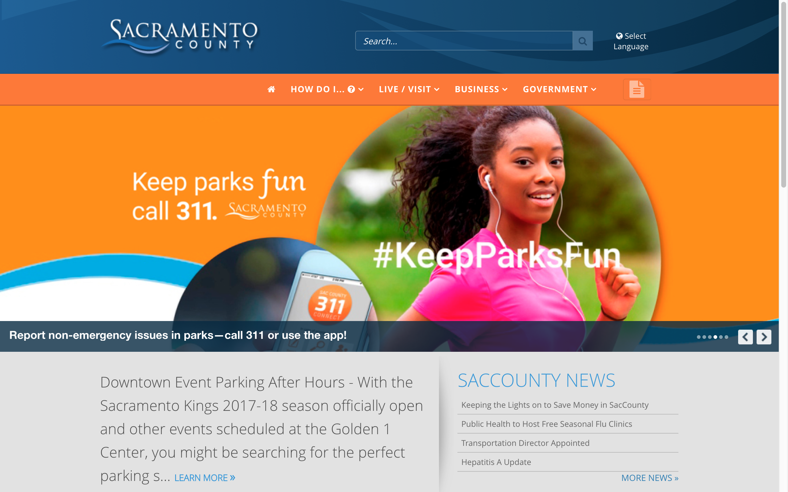
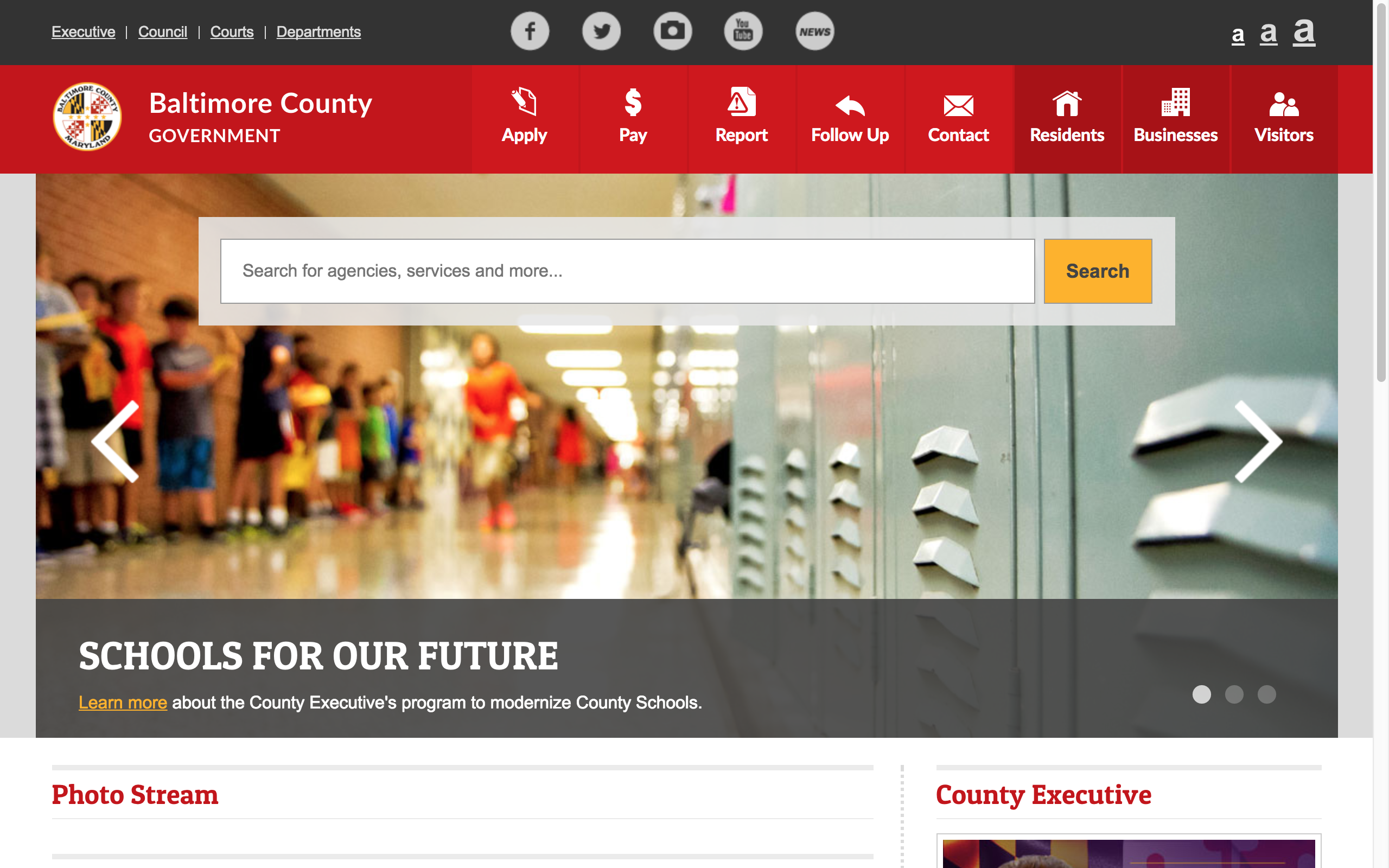
These counties were selected primarily because they have been selected as examples and been discussed about on a number of articles for having a great design.
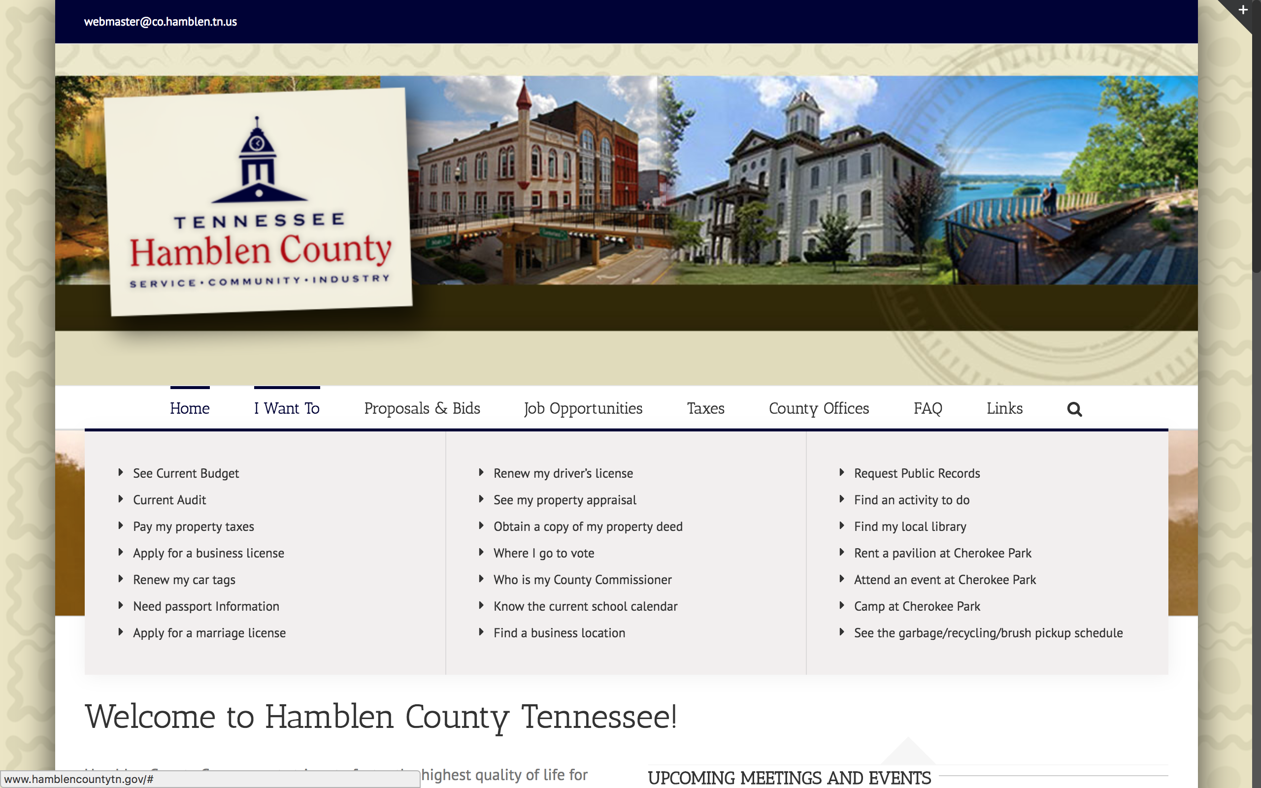
There is no clear orgnization of the 'I Want To' tab. Similar websites group links together based on the task or type (for example, grouping 'apply for a business license' and 'apply for a marriage license'. This makes searching for information inefficient.
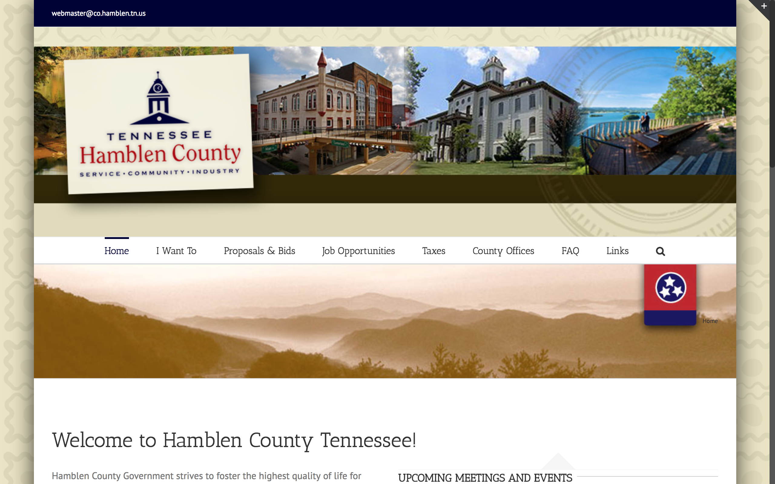
Furthermore, the additional spacing that hides 'Upcoming Meetings and Events' and 'Quick Links'. These are likely very important information, so they should be given greater prominence. Users might also expect announcements to be clearly visible. On the Sacramento County website, at least 50% of the screen is given to news and 30% to other news and important information.
The footer also serves little purpose. Most websites typically contain links and other important information listed below, and first time visitors would likely assume the same as well.
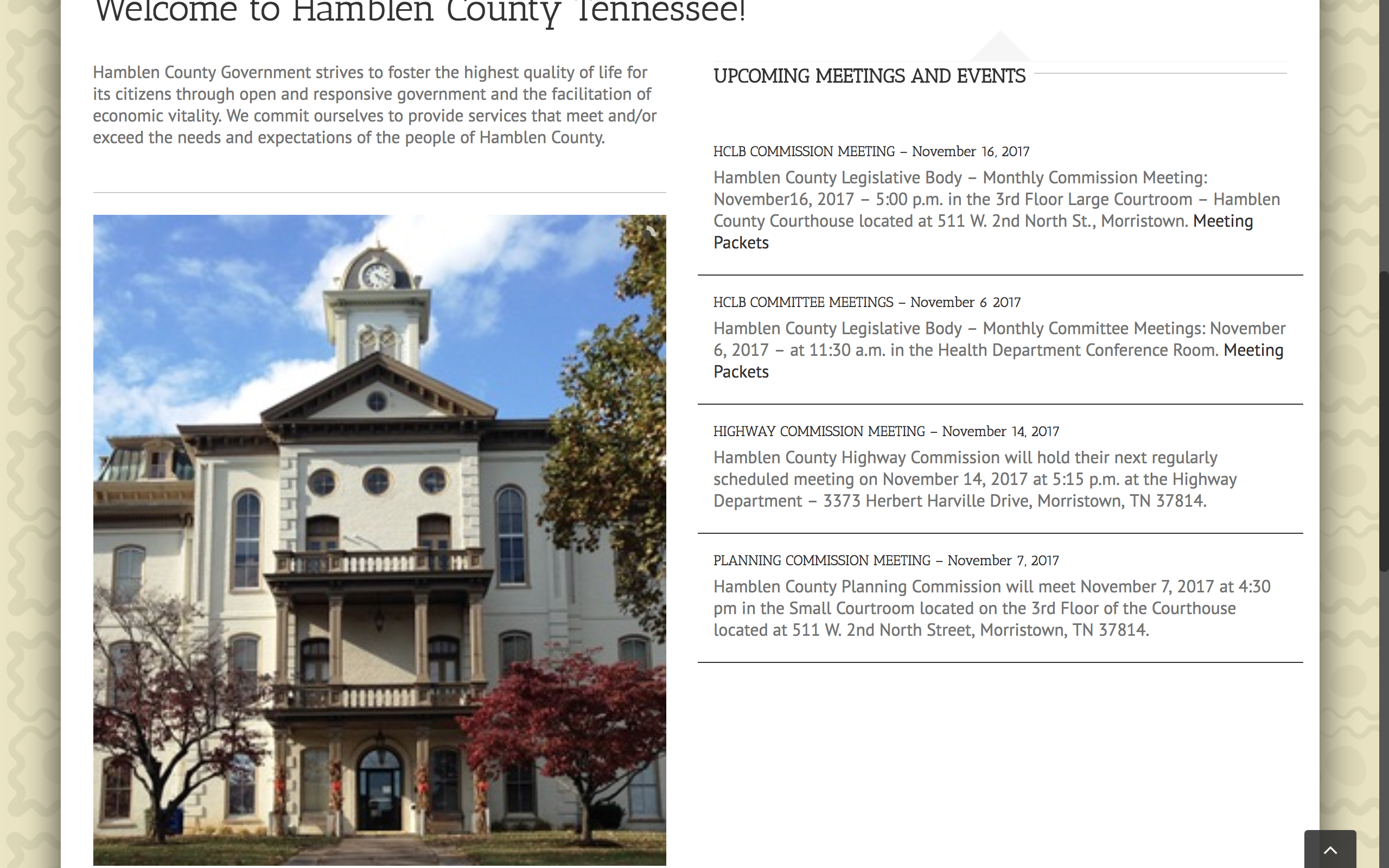
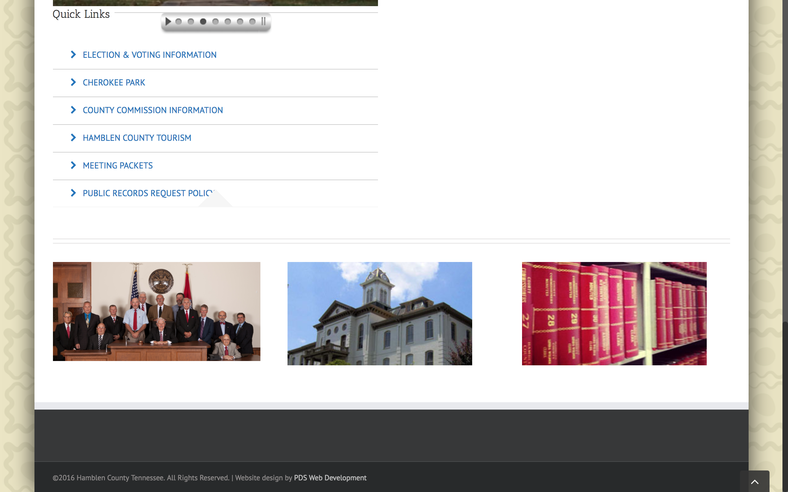
Overall, information is difficult to find due to lack of visibility and clear organization.
Design
Identifying the key requirements led to the first iteration of the homepage redesign. This was presented to the client, along with a synthesis of the user research findings. The designs below have been iterated upon.
- Simplify the current design so that it is cleaner and easier to scroll through
- Let important information stand out
- Highlight the features of the county
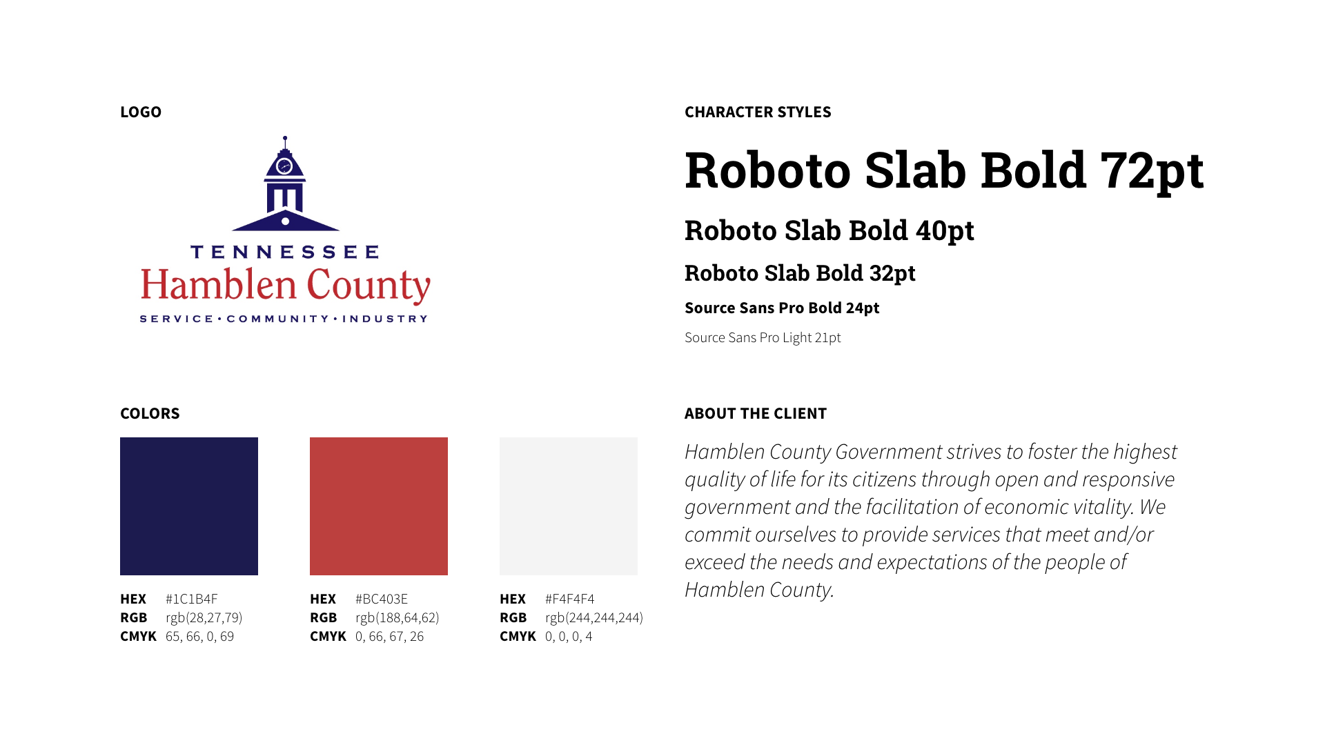
For the County Offices pages, I considered how the web content would be managed. I wanted to clearly define the purpose of each section for better orgnization so that each page had a 'template' aspect, and then could be tailored depending on the page requirements. Below are the mockups for the three commission pages. Some of the changes made include:
- Distinguising between 'links' and 'files'
- Removing the accordian menu for questions
Reflection
If I were to continue on in this project, I would: 1) consult with community members through a survey or interviews for further feedback; and 2) conduct user testing to compare the effectiveness of revising the "I want to..." links layout and other components.
While communicating with my client, they mentioned how older individuals would miss dates for community events and would check the County Commision page, rather than consulting the home page (which I found surprising). They also mentioned how sometimes, while updating the pages, they (the client) would forget to update the County Commision page since that was an additional step in their process. Based on this, providing additional solutions to address this issue would be another aspect to address.