ux design, user research
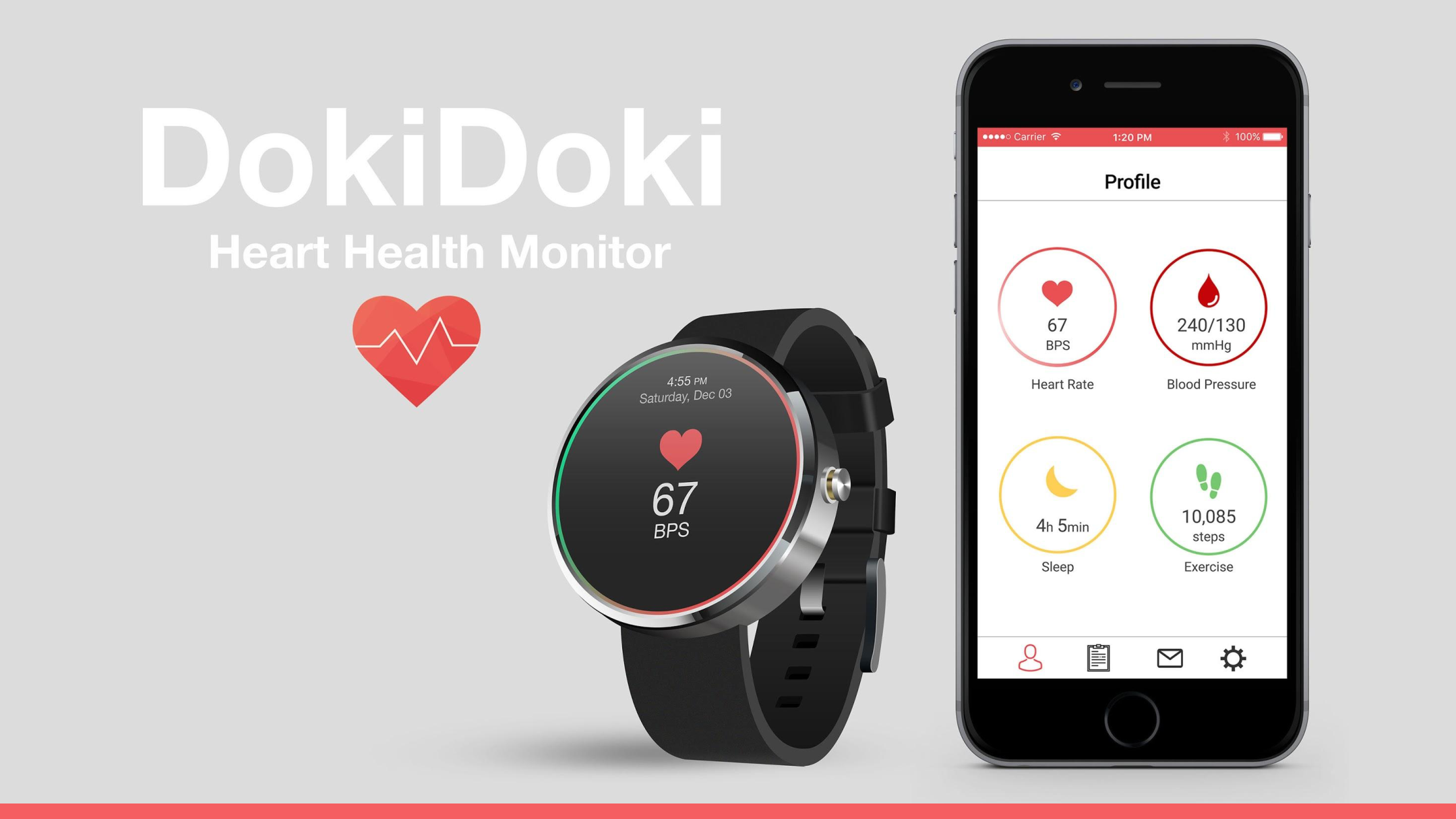
DokiDoki
Help make America healthier one heartbeat at a time.
Timeline
September 2016 - December 2017
Teammates
Yeqing Lou (HCDE), Tianyu Ge (INDE), Andrew Diebag (INDE)
Role
UX Designer & Researcher
Tools
Figma, Invision
Project Overview
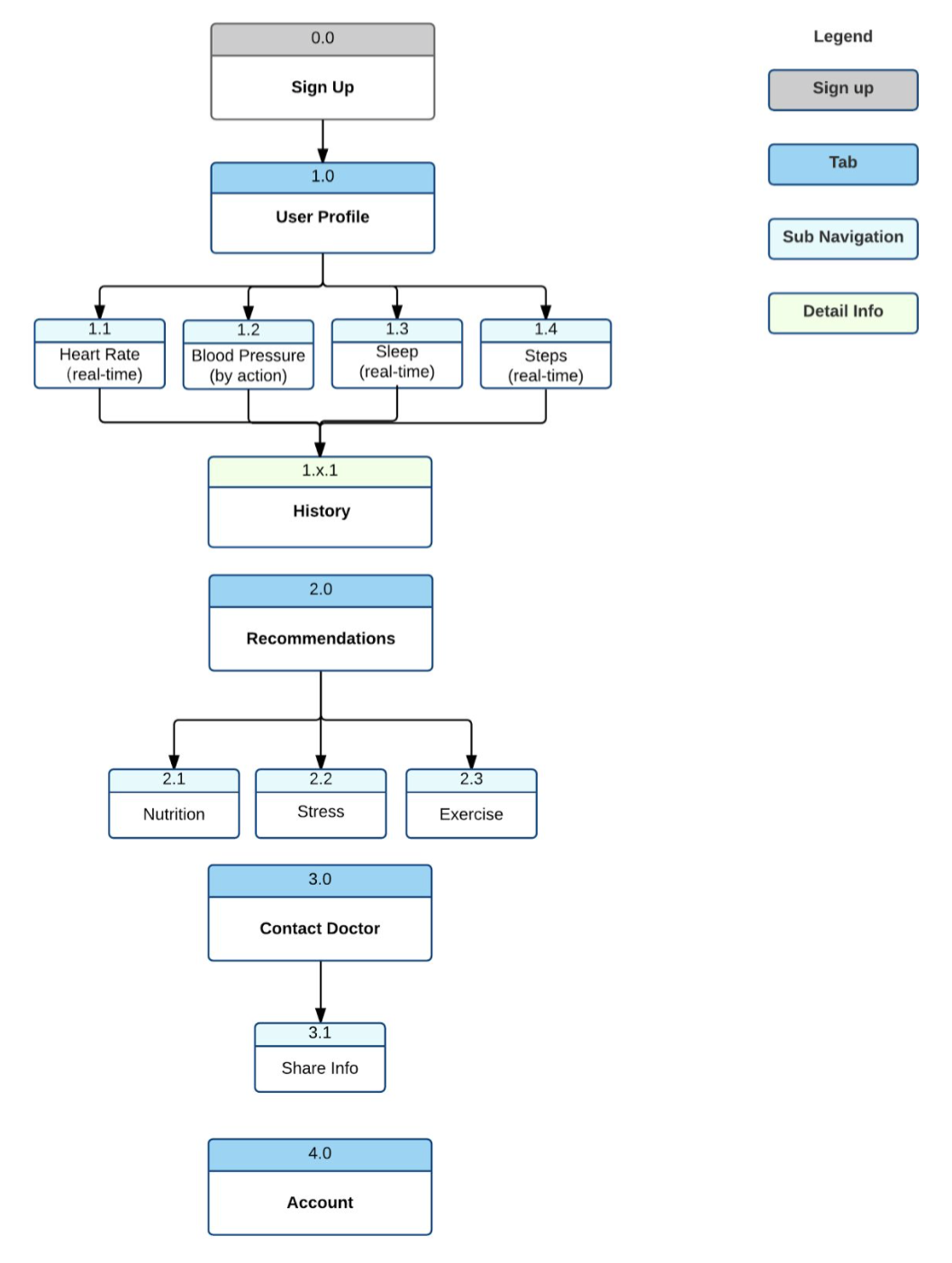
This project was completed for HCDE 455, a joint course with the Industrial Engineering Department. The Heart Health Monitor is a device aimed at improving the health of students and professionals by providing a stored history of heart performance for medical use, education on heart diseases and lifestyle improvement opportunities, and an early warning system for heart disease development risk. It is intended to be a wearable device that the user can integrate into their already existing lifestyle, building off pre-existing wearables and existing technologies to provide a user more in depth information on their health. Our design requirements were to:
- Measure and track pulse dynamics and other physiological states
- Display several key parameters of heart health
- Recommend nutrition, stress and exercise options to improve health
"DokiDoki" is an onomatopoeia for the sound a beating heart makes in Japanese.
User Research
The requirements of this project was critical in my understanding of the task at hand. Having little knowledge in this field, each of us conducted research about how to monitor heart health, how we would monitor the data and how the information would be presented back to the user. The initial research began with literary analysis, market research and current treds.
From here, we researched current methods for evaluating high blood pressure, which is a key risk factor that raises the chance of developing a heart-related disease. The two tests evaluated were:
- Electrocardiogram (EKG): can be conducted with only two points of contact between your skin and two electrodes by reading your heart's electrical activity and records the normal heart rhythm, as well as any abnormalities that may be occurring.
- Blood pressure tests: measure tension in your arteries caused by increased blood flow.
To evaluate and give recommendations on heart disease risk, we researched into the Framingham Heart Score. The algorithm uses family history, life habits, and other questions to produce a 10 year risk number of developing or having heart disease. Between the Framingham Score and EKG trends, our team agreed that we would be able to present accurate data/recommendations to users.
- Mocacare: a brand of heart information and data visualization products that focus on heart rate and blood pressure. MocaHeart is a vital signs monitor, that allows a user to get on the go measurements of heart rate and blood oxygen, while MocaCuff is a wrist blood pressure monitor. The main goal of Mocacare is to empower people to make healthy habits, design a product wary of users, make it easy for self care, and simplify everyday health monitoring.
- Qardio: has an EKG wrist interface as well as a smart blood pressure device, but also has a scale system so the user can update their BMI and track their daily weight. Their “state of the heart” technology is aimed at designing an innovative new way to monitor your heart that fits the modern lifestyle.
- Kardia by AliveCore: a clinically validated mobile EKG device that fit on the back of your phone. It allows a user to manually read their heart rate, and allows for a user to track palpitations, shortness of breath, and other patterns.
- How to collect reliable and accurate information. The device will need to collect accurate information because the user’s well-being and awareness may be dependent on it. This will affect the design decisions on how the device will be worn and where or how the information will be collected. We have already decided to use a combination of EKG readings and the Framingham risk score, but we need to make sure the app can analyze an EKG reading effectively and establish a baseline that is appropriate for each unique user.
- How to represent the information in an easily understandable manner. The information be easy for anyone to understand regardless of how knowledgeable they are. Since large amounts of data will be collected, as a group, we must consider how the information will be presented and how quickly can they process the information.
- Considering the effects of the design on how the device is used. Integrating the device into daily life means that it should not affect how they function normally. Depending on how the device will be worn and how the data will be collected, the overall design of the device could vary from around the wrist, bicep or chest. Another impact will be the size and weight of the device.
- Protection of User Information. Since all the data we are collecting is intrinsically private to a user and their health care providers, we must make sure we establish the appropriate security measures with the data collection and storage parts of the wearable, and any phone app we may use.
Ideation
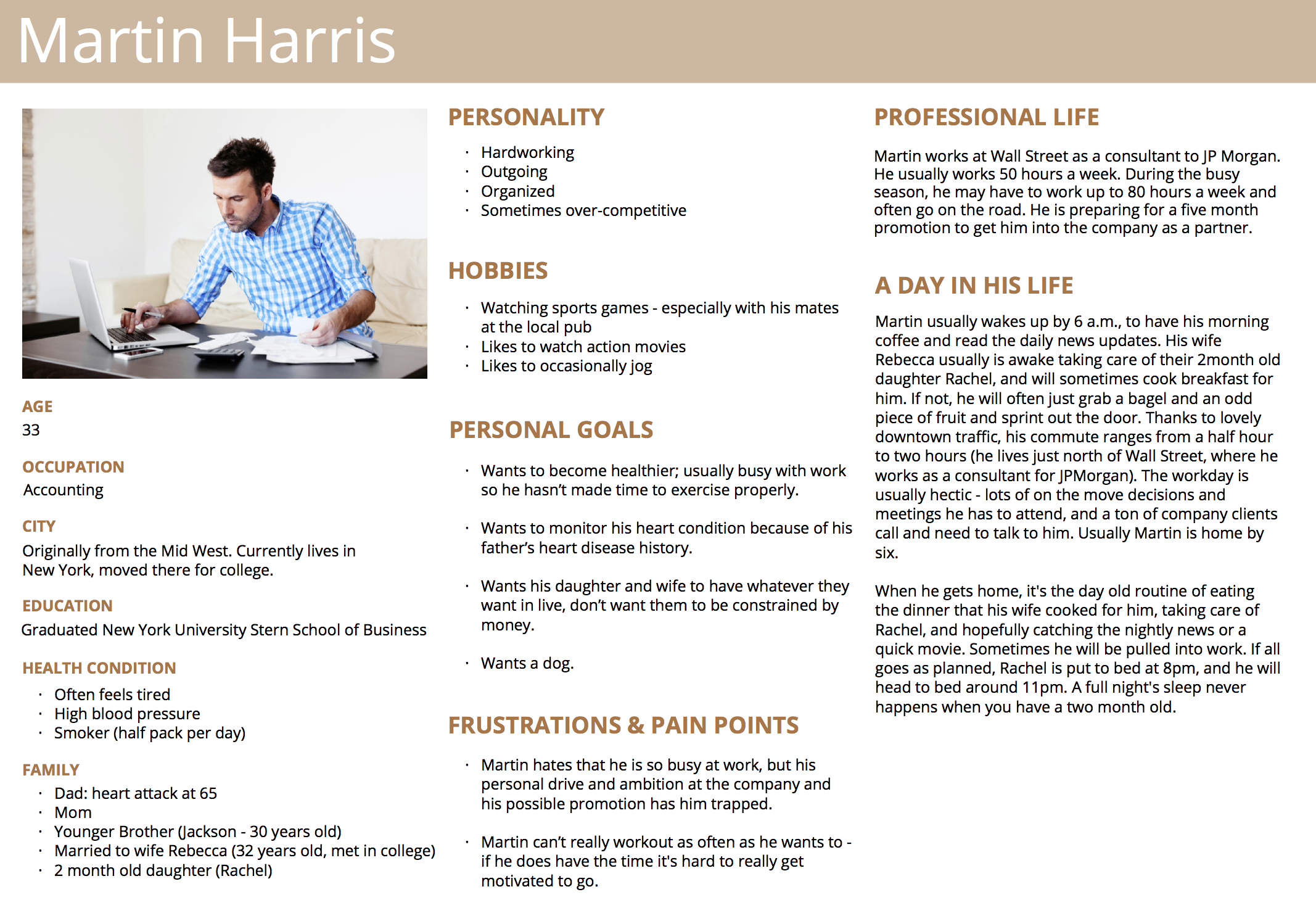
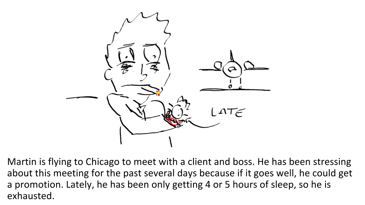
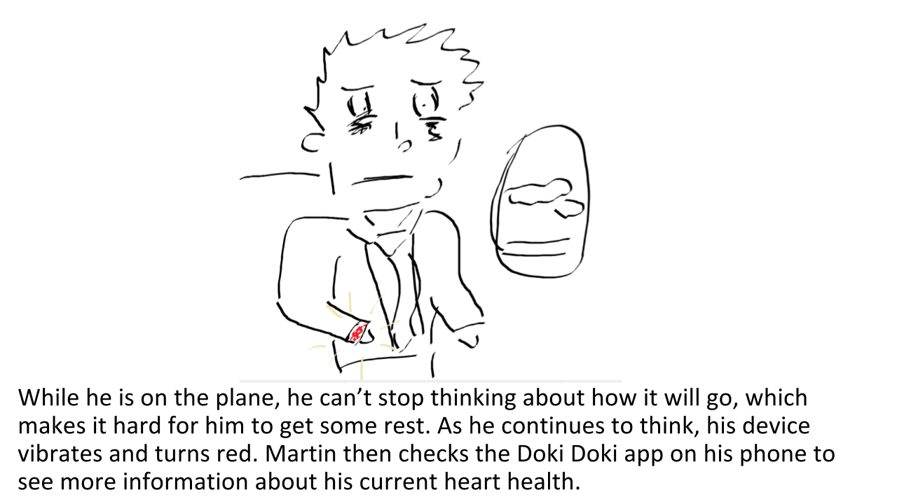
From our findings, we delved into what our product would look like. Analzying our research data led us to our persona, Martin and his storyboard.
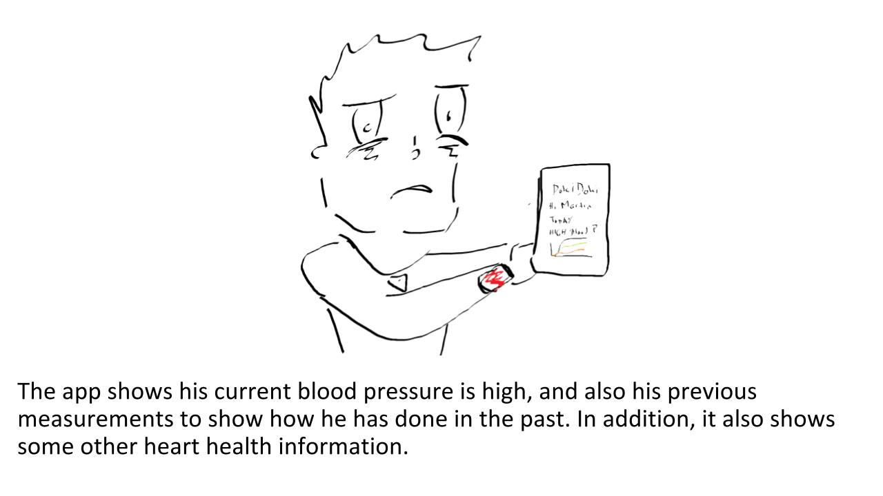
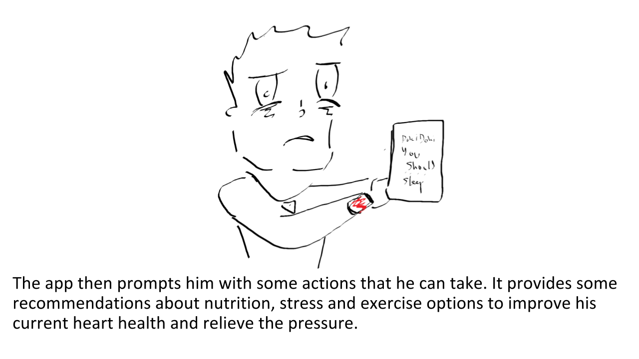
- Find health recommendations on how to improve their current condition.
- View progress by comparing their current hearth health to previous.
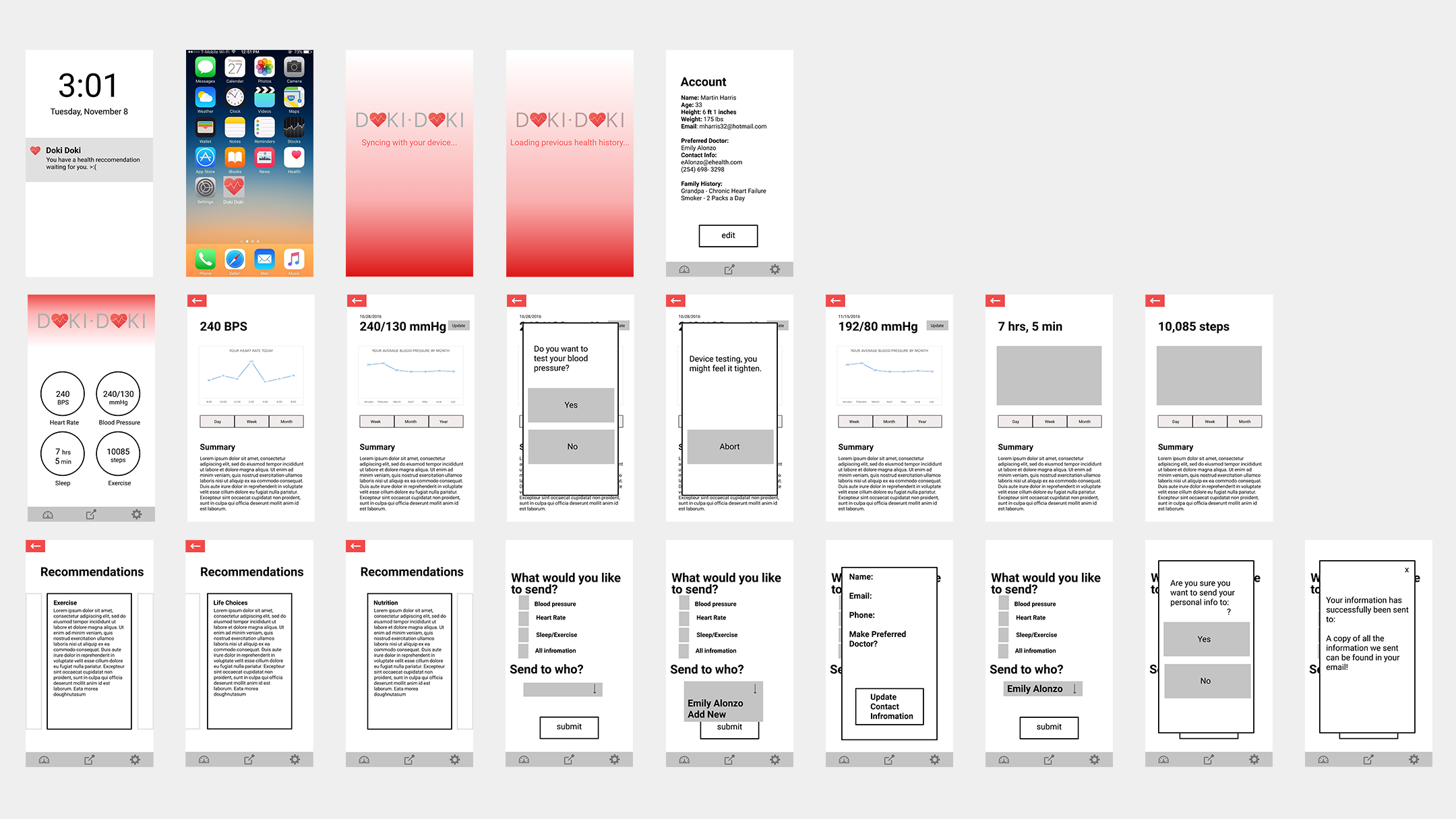
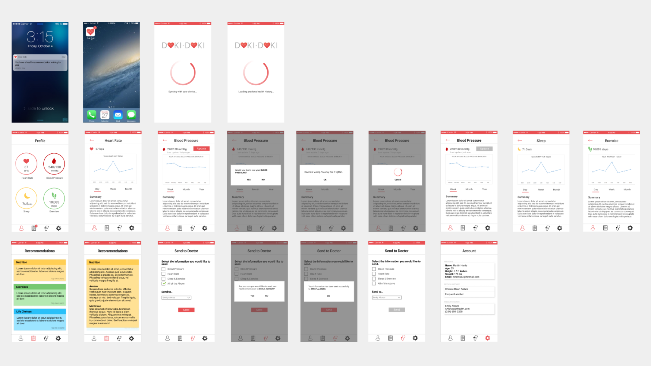
Iteration
Two rounds of usability testing were conducted with 7 users each time. Their responses were insightful and helped improve the overall design of the app and wearable.
- Find recommendations on how to improve your heart health.
- Look at your heart rate and update your blood pressure levels.
- Send all your heart health information to your doctor, Emily Alonzo.
Overall, the app had a nice balance between functionality and intuitiveness, but most users had trouble determining difference between the 'Send to doctor' and 'Recommendations' icons.
Reflection
One of the most enjoyable aspect of this project was the user testing. While we had done this in the past, it was either briefly or not for a product we had designed ourselves. It is always exciting to see other people experiencing something you designed yourself and put tons of effort into. This also included when things didn’t go as expected. For example, during the paper prototype, we had a push notification, but most people didn’t use it. Instead, they navigated through the home screen to access the app. Once we had switched to the inVision prototype, people immediately wanted to start using the push notification. Our designs hadn’t changed, except for how they were presented. I believe this happened because the mockup looked more like an actual product and was presented on a phone, which was something people were more experienced with. The paper prototype was printed larger than the expected phone size and was also in black and white. As a result, I don’t think people immediately recognized that they could interact with it exactly the same as they would with the phone version.
Overall, I had a great experience working with my group. There were moments where we were unable to meet in person due to busy schedules, but we were able to communicate effectively by messaging each other and making sure we were all on the same page. This made completing deliverables easier because we had similar ideas going into each of the assignments. When we were able to meet in person, it was highly collaborative and easier for everyone to share their ideas.