ux design, capstone project
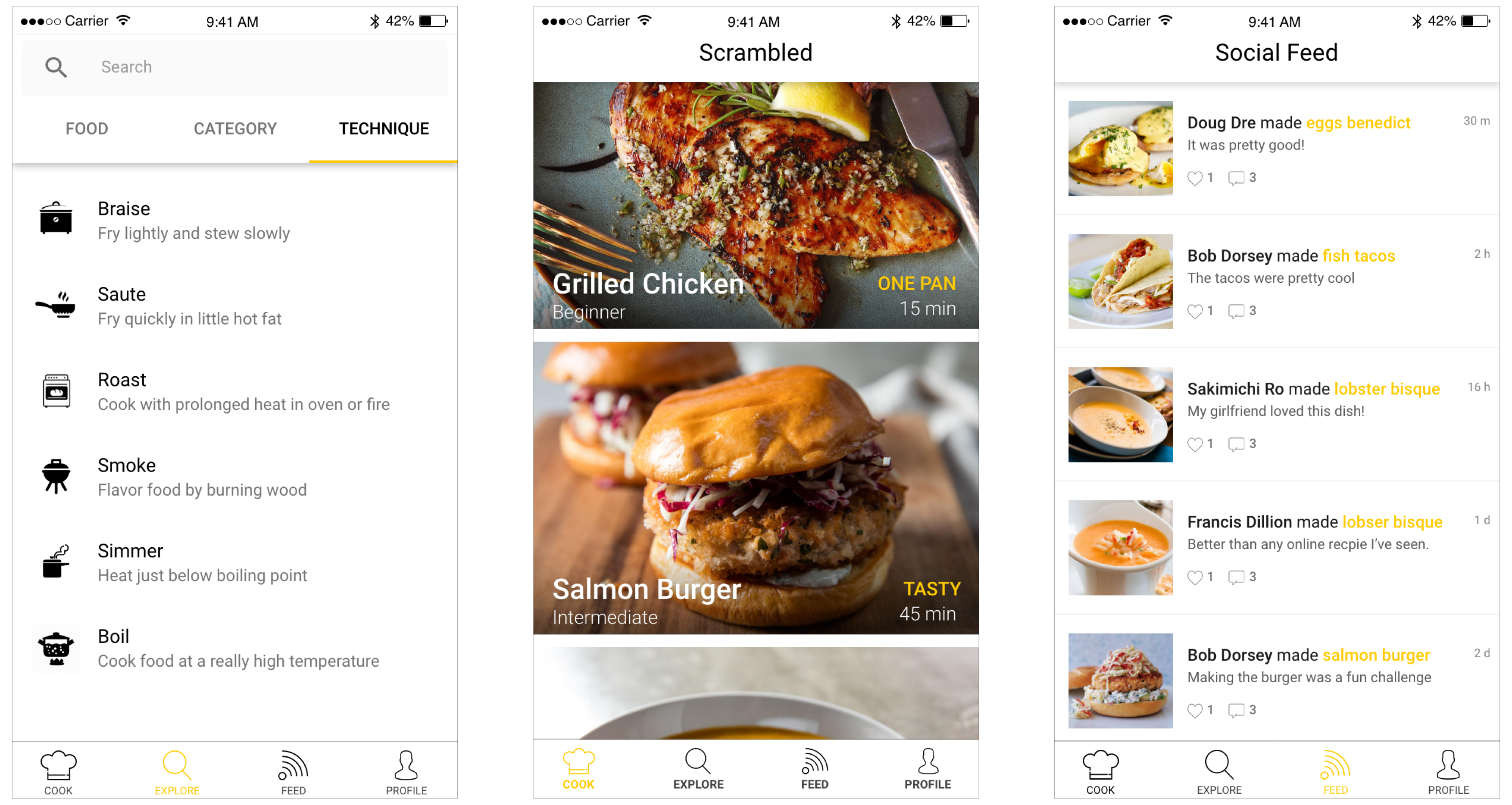
Scrambled
Motivating millennials to cook at home more.
Timeline
January 2017 - June 2017
Teammates
Calob Mejias, Alex Pease, Andy Truong
Role
UX Designer & Researcher
Tools
Whiteboarding + Sticky notes, Figma, Adobe Xd, Invision, LucidChart, Framer
Project Overview
With common interest, our team members want to address and solve a problem with cooking. Background research revealed that many Millennials were cooking less at home and this is becoming a health concern. Although there are a number of benefits from cooking at home, such as saving money and better nutrition, Millennials are opting to do otherwise. We investigated and researched the underlying problem of why Millennials are cooking at home less compared to previous generations, and came across two interesting points: lack of confidence and knowledge.
Scrambled is an educational cooking app concept designed to motivate people to cook more through education and social interaction. The hope is that one day, there won’t be a need for a product like this and that users will be able to have the skills to cook whatever they want without having to follow a recipe. Part of cooking is the ability to have fun and be flexible with the ingredients you have on hand, rather than a stressful experience that makes people less willing to cook.
User Research
The initial user research provided understanding of our target users, and the problems aligned with current cooking solutions. From the survey, interviews, deep hanging out study and comparative analysis, we were able to recognize the need for a more personal cooking experience that focused on personal growth and learning experience, rather than ‘how to cook’ and following step by step instructions.
This generated the following app design requirements: make cooking fun, fast, and educational. From here, we wanted to create a user-centered cooking app. This means that users input their age, preferences, cooking habits, and receive an educational cooking experience tailored for them. These were the following features we considered:
- Suggested recipes based on favorite cuisine, budget, and cooking level
- User-inputted grocery list that tracks what you have, don’t have, and need
- Recipe measurements based on unit preference and serving size
- Recipe description level based on preference (e.g. simple vs. scientific)
All of our participants noted that they often encountered the issue of not having all the ingredients on a recipe. The availability of ingredients in a person’s inventory is an important factor to consider when making a recipe. They also noted that pictures or videos were helpful for them to make or find recipes.
Our requirements continued to evolve, and we added additional design requirements:
- Educate users on substitutable ingredients and ingredient knowledge like which ingredients pair well with others
- Create a way for users to track their ingredient inventory and suggest recipes based on what they have
All of our participants noted that they often encountered the issue of not having all the ingredients on a recipe. As a result, it was important to consider the availability of ingredients in a person’s inventory. They also noted that pictures or videos were helpful for them to make or find recipes.
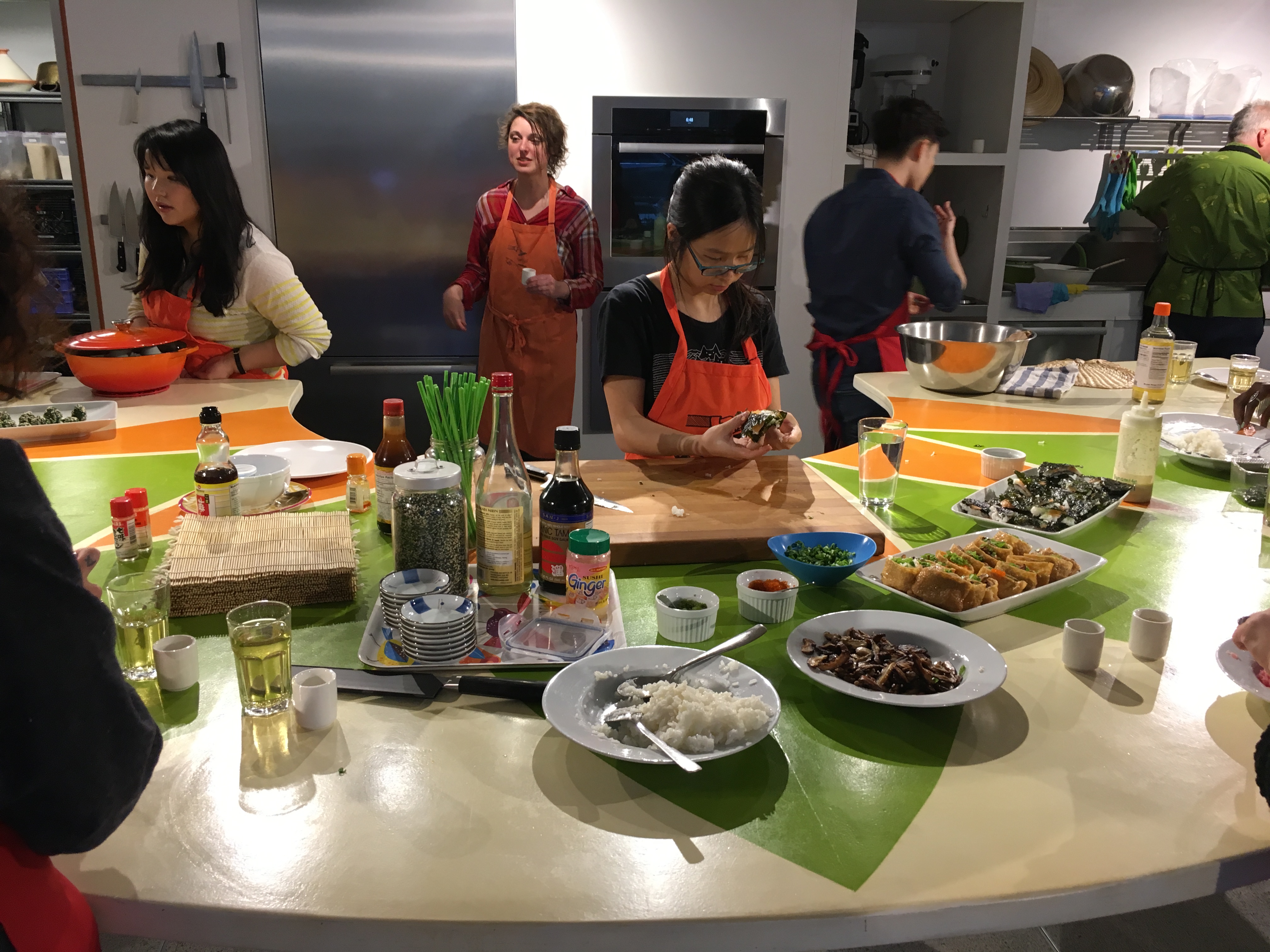
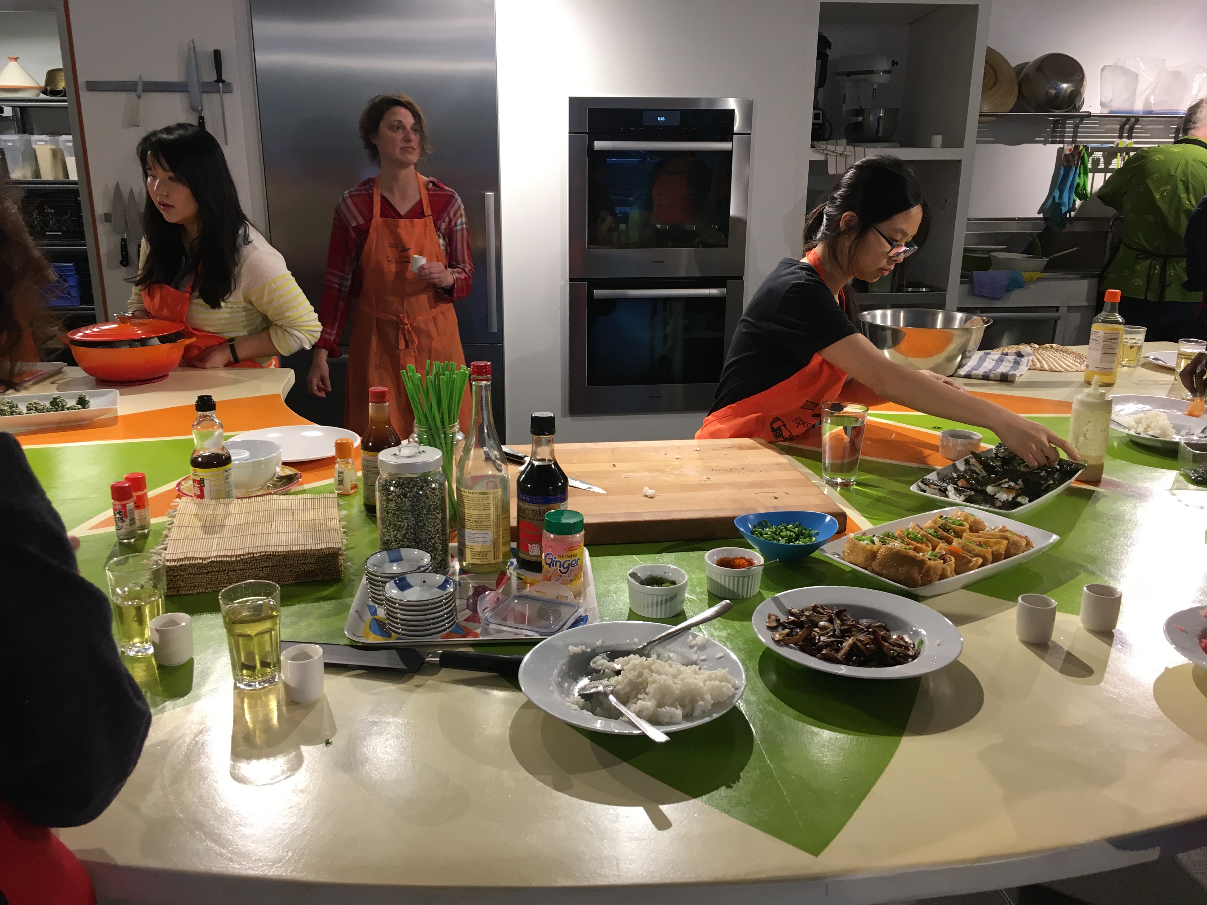
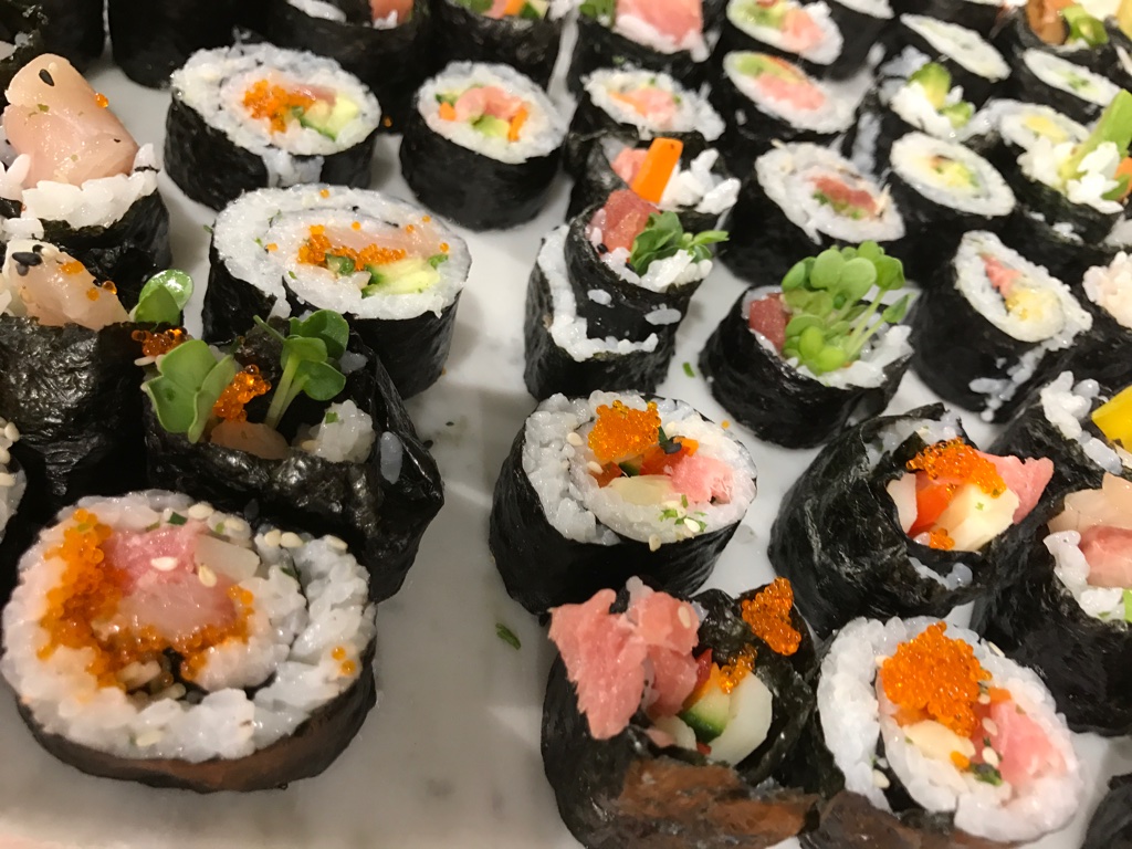
While not the traditional, Japanese sushi, it was still a fun experience overall. Students were able to be creative with their food, and it made them more confident. Much of the overall, positive experience was being able to interact with other people and being able to help each other out. This inspired our main interest in social cooking and how we can tackle that problem through design. Although not all the elements could translate well to a digital solution, increasing engagement might also improve participation.
Ideation
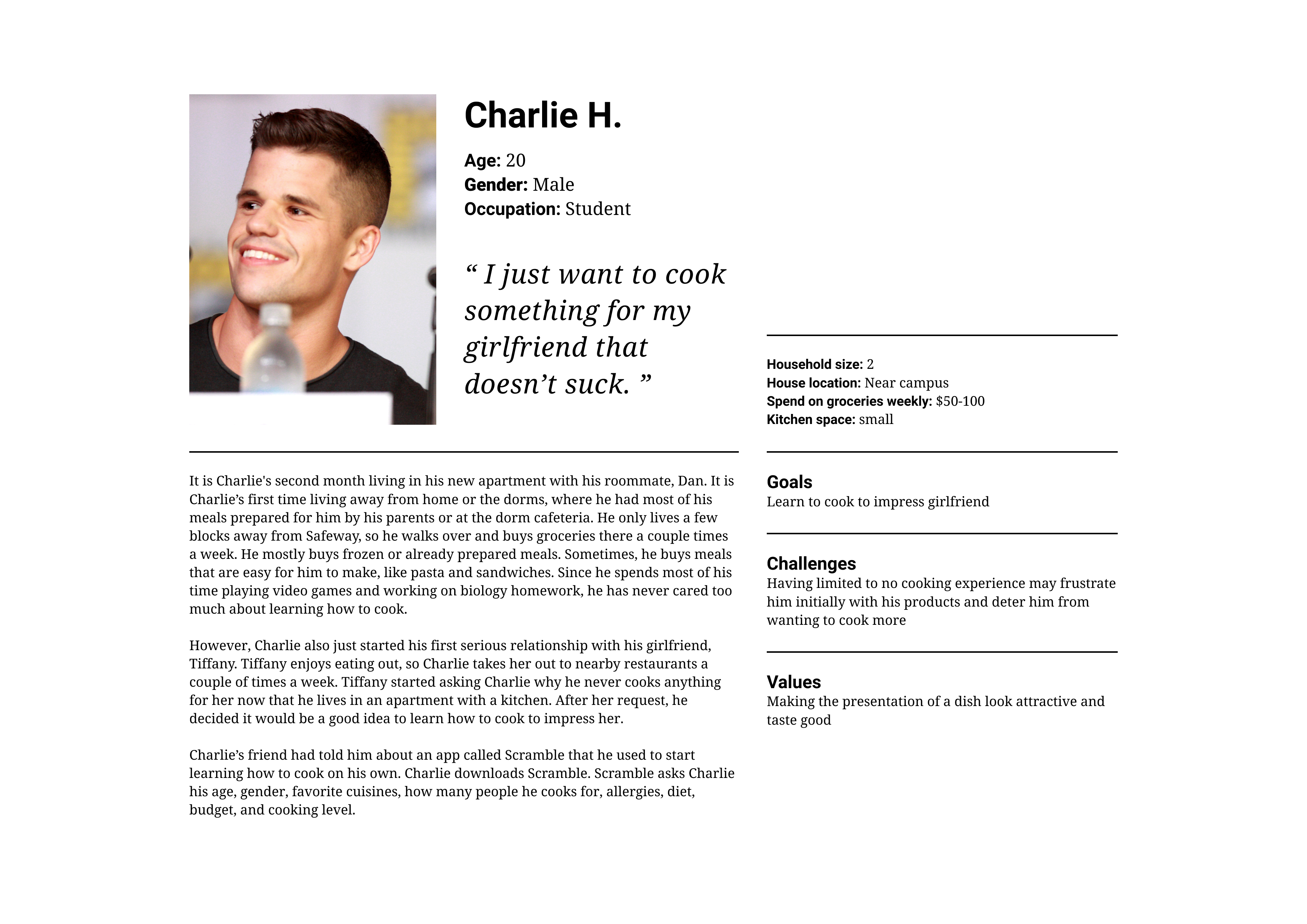
Following our user research findings, we created our personas (3) and designed requirement matrixes to determine the main problems and features we needed to consider. These personas gave us a deeper understanding of why users how users might interact with the app and what they would value the most.
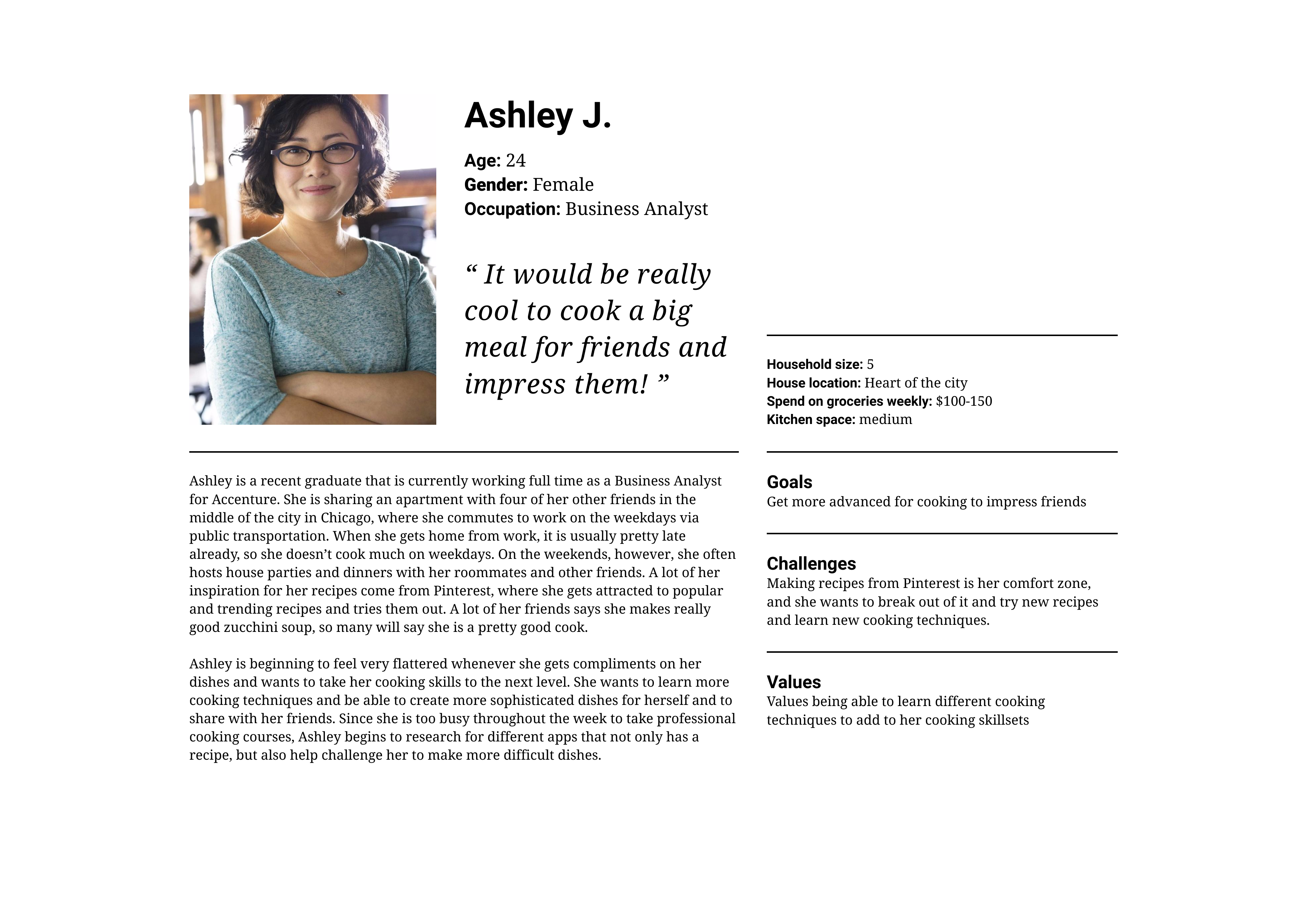
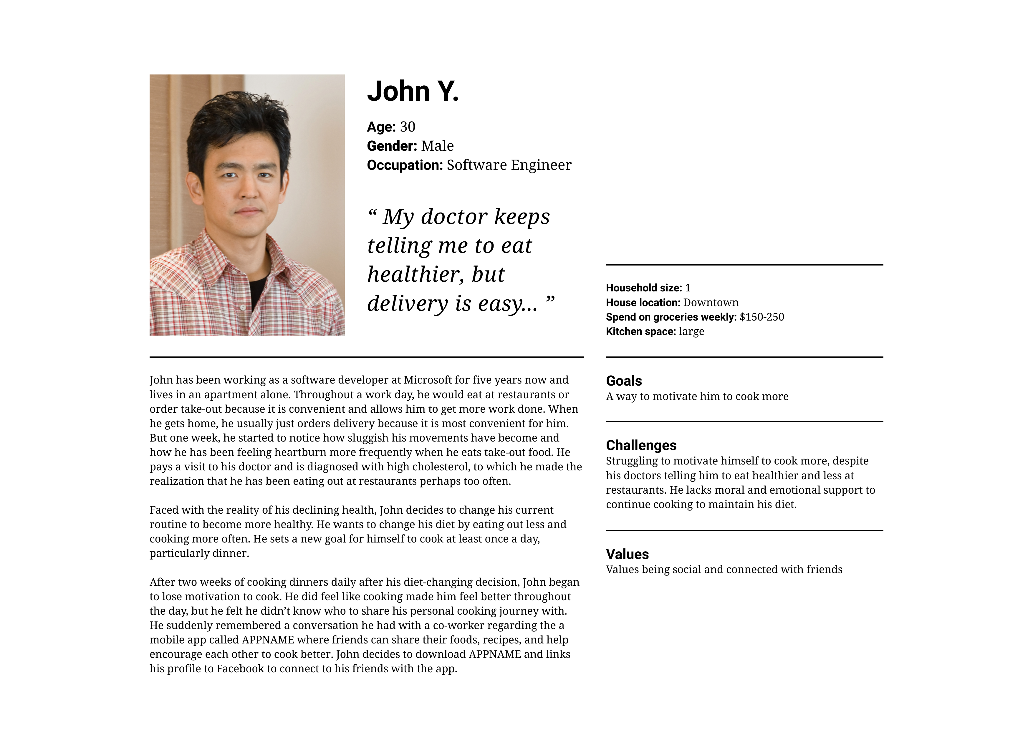
Based on the matrix, we realized that cooking knowledge was the most important problem. After identifying the educational theme of our app, all of the features we brainstormed earlier were listed again. Similar to before, we rated whether each persona would not care (X), care (checkmark), or feel neutral (0), about each feature and mapped them to their respective score (-1, 0, 1). Higher totals indicated main features that should be implemented first.
.jpg)
.jpg)
.jpg)
Iteration
As the understanding of our project and product grew, we moved on to the next stage of iteration and validating our design decisions. After the paper prototype, we conducted guerrilla usability testing for quick feedback. Once our concept became more concrete, we conducted participatory design before moving on to our final prototype.
- Attach the start lesson button to the bottom of the page
- Create highlights for when certain features, such as detailed vs. basic view are selected for nutrition information
- Only show nutrition information for people that select health as a priority in the onboarding screens
Implementation
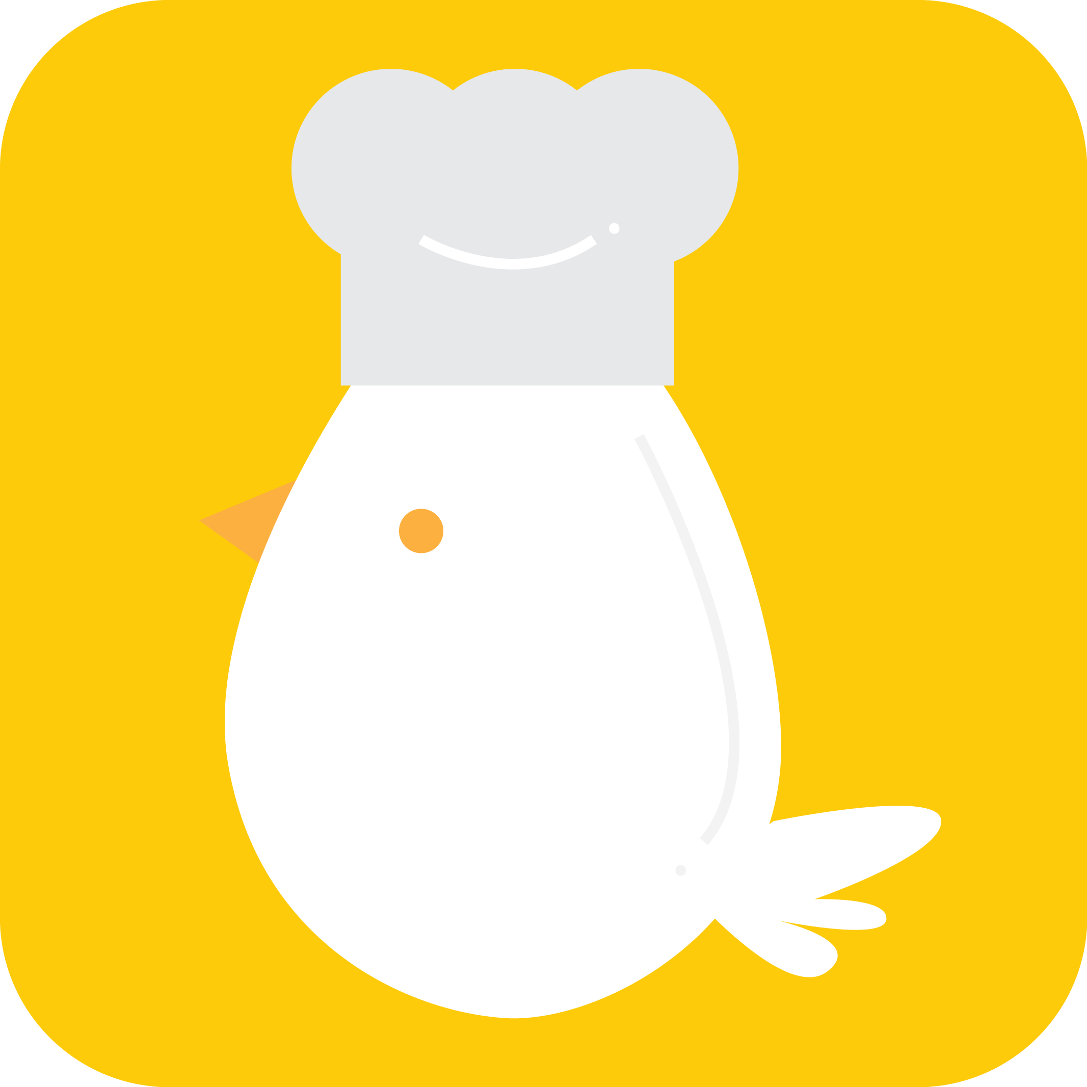
Moving towards the final prototype, we finalized the designs in Adobe Xd. I also designed the app logo and during the process, considered how the app goals and purpose could be conveyed through it. The final mockups and logo were featured on the presentation poster (which I designed as well) and other materials.
The egg is intended to look ‘cartoonish’ to create a more fun and relaxed environment. The goal of our app is to make cooking fun and engaging while also being educational, so having a cute character adds to those aspect by making it less serious. This is furthered by the bright color scheme that is reflective of the app and to give a welcoming feel.
Reflection
During the Capstone Open House, one of the comments we heard frequently was if we planned on developing this idea further, and that they would download it if given the opportunity. This feedback was insightful because it meant there was a definite need in the community for a product like this, and that potential users understood the purpose and goal of this app.
With all apps, there is always room for improvement. One of the questions we were asked was: where the recipes will come from and how will they be curated? The current content is being pulled from recipe websites, and then revised to fit the format of our app. This would likely not be possible if we were to release the app, since the recipes came from websites which have their own. Additionally, it would likely be an issue of licensing and ownership rights.
That said, I am proud of what we have accomplished. There were times where we did feel short on time and wish we had begun our initial user research, but we were able to meet all of our milestone dates with some adjustments. For example, we underestimated the time needed to process the user research, design the personas and validate our design decisions, so our schedule was adapted to make sure it could get completed and still meet all our other deadlines. If given more time, I believe we could have further refine our visual design and flesh out the onboarding sequence more and perhaps dedicated testing solely for it. Our demo during Capstone focused primarily on being inside of the app, so there wasn’t much consideration about logging in and finer details for onboarding.